


As a dark horse that defines the new retail industry for girls, Qpokee has a few stores in Heshenghui, Joy City in Beijing, and the overall sales data is also well ahead in several major shopping malls. After receiving this design task, we put aside business forms first, but to discuss in depth what does Qpokee need? So we worked with the excellent Qpokee team to refine our design task. Which is, Qpokee's customers, products, space.
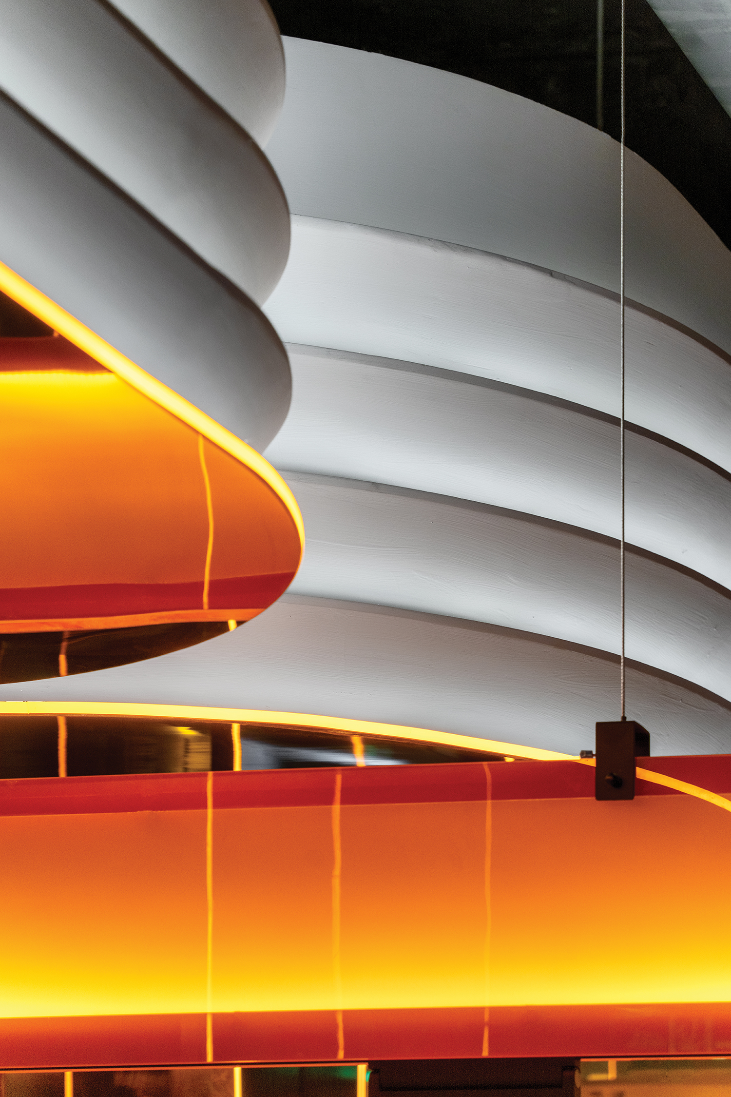
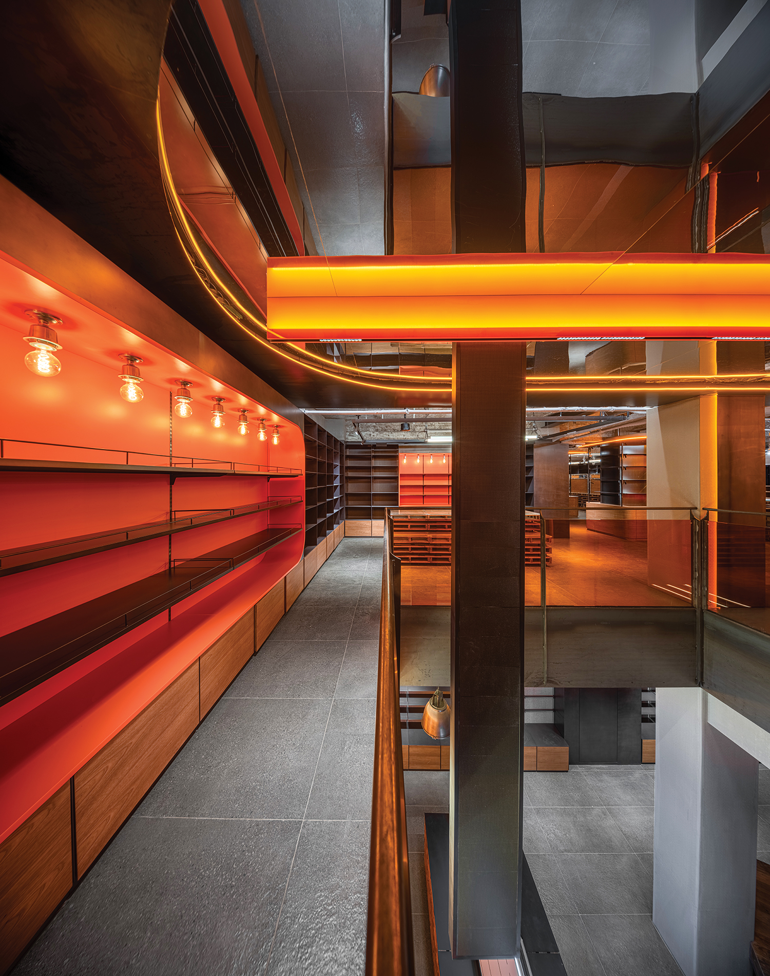
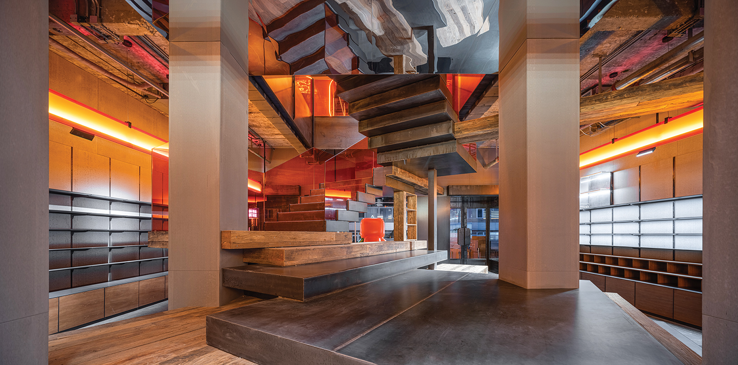
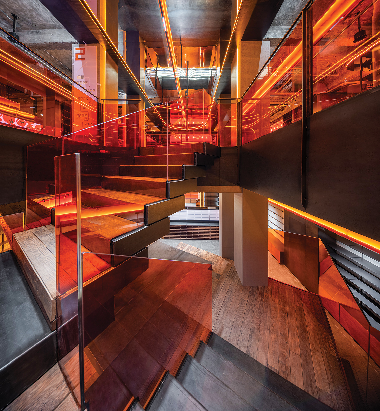
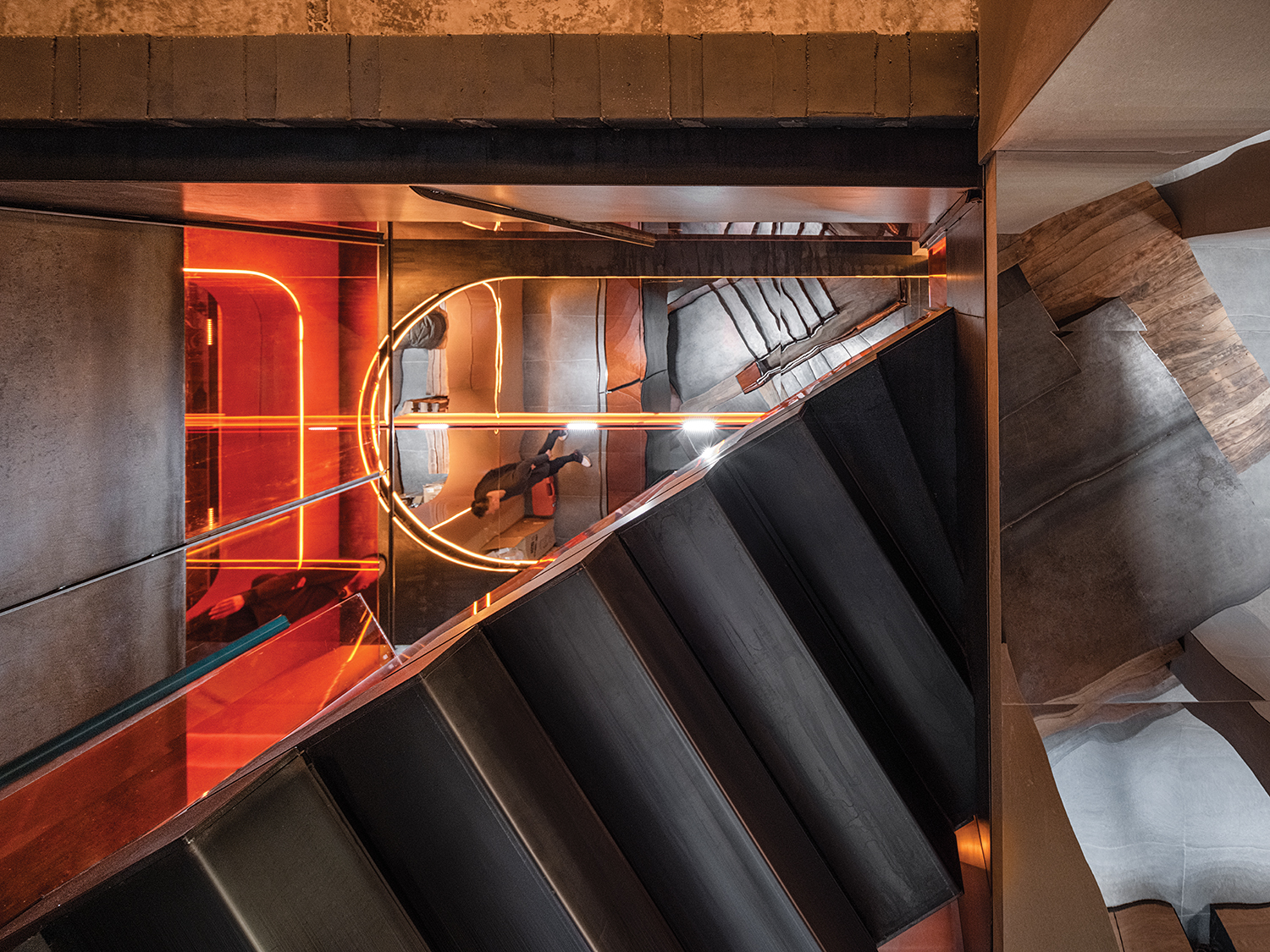
T his store is located in the Middle street of Sanlitun. This street, which connects to the north and south districts of Taikoo Li, is continuously redefined in the process of urban renewal. The store has a unique geographical advantage for its core business, but it also has its own shortcomings: The store is 500 square meters, but the first floor has only 100 square meters, the floor height is relatively low, and the location doesn't have many passenger flow, etc. In this part, we used the representative tomato color of Qpokee as the main color, and used the largest area to make a large display window, so that the overall Qpokee brand can be enhanced, and stopping, visiting, and staying of dynamic passenger flow is also increased.
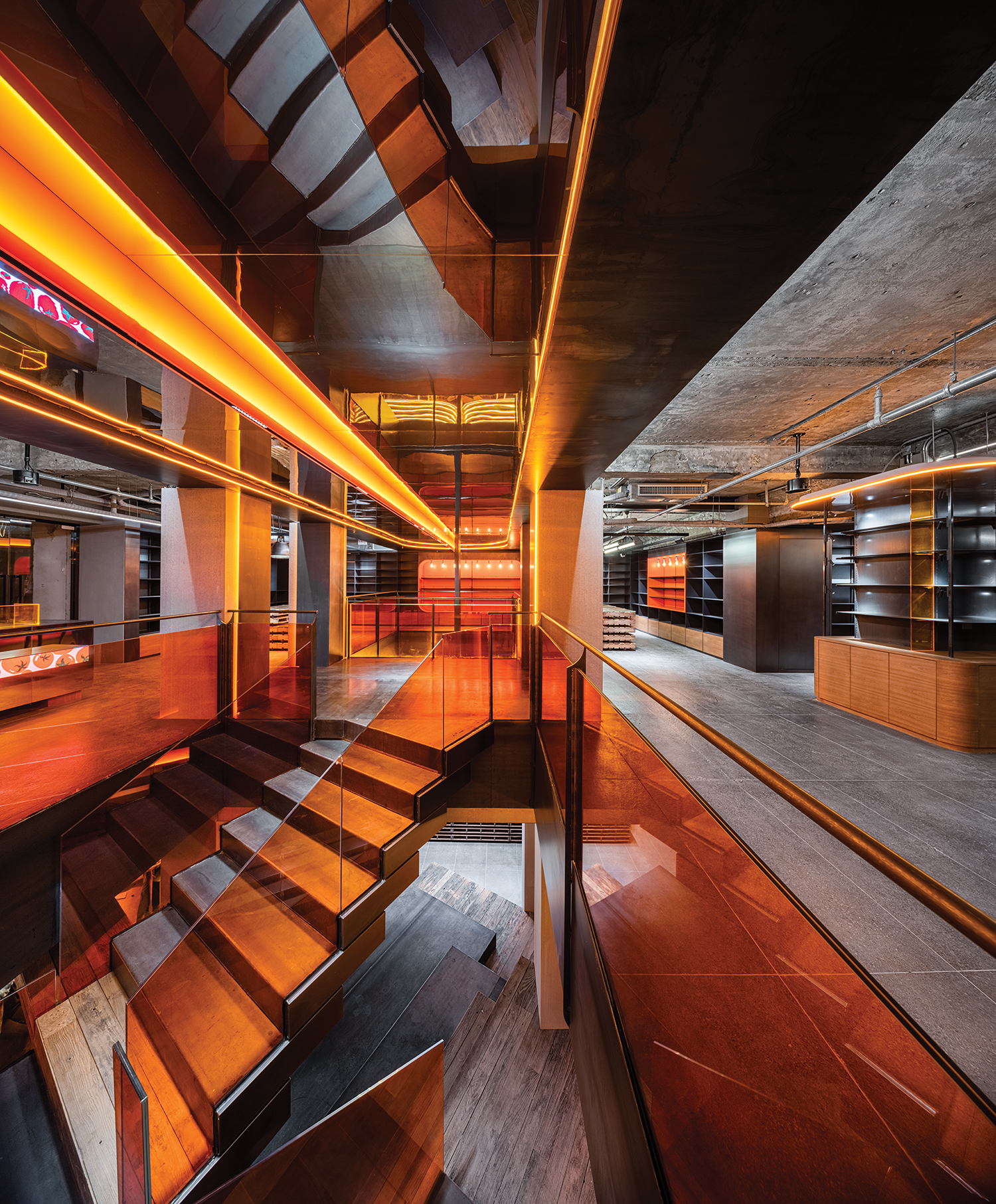
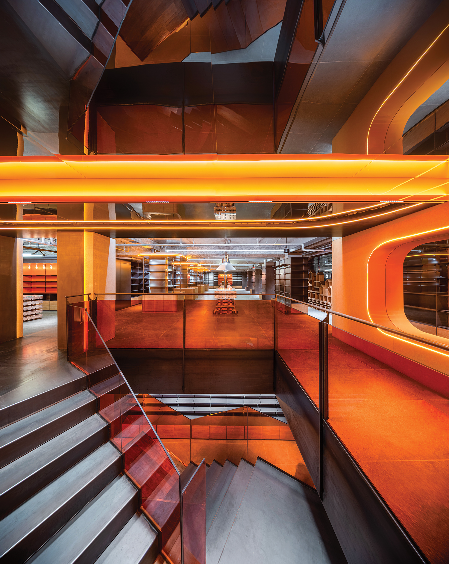
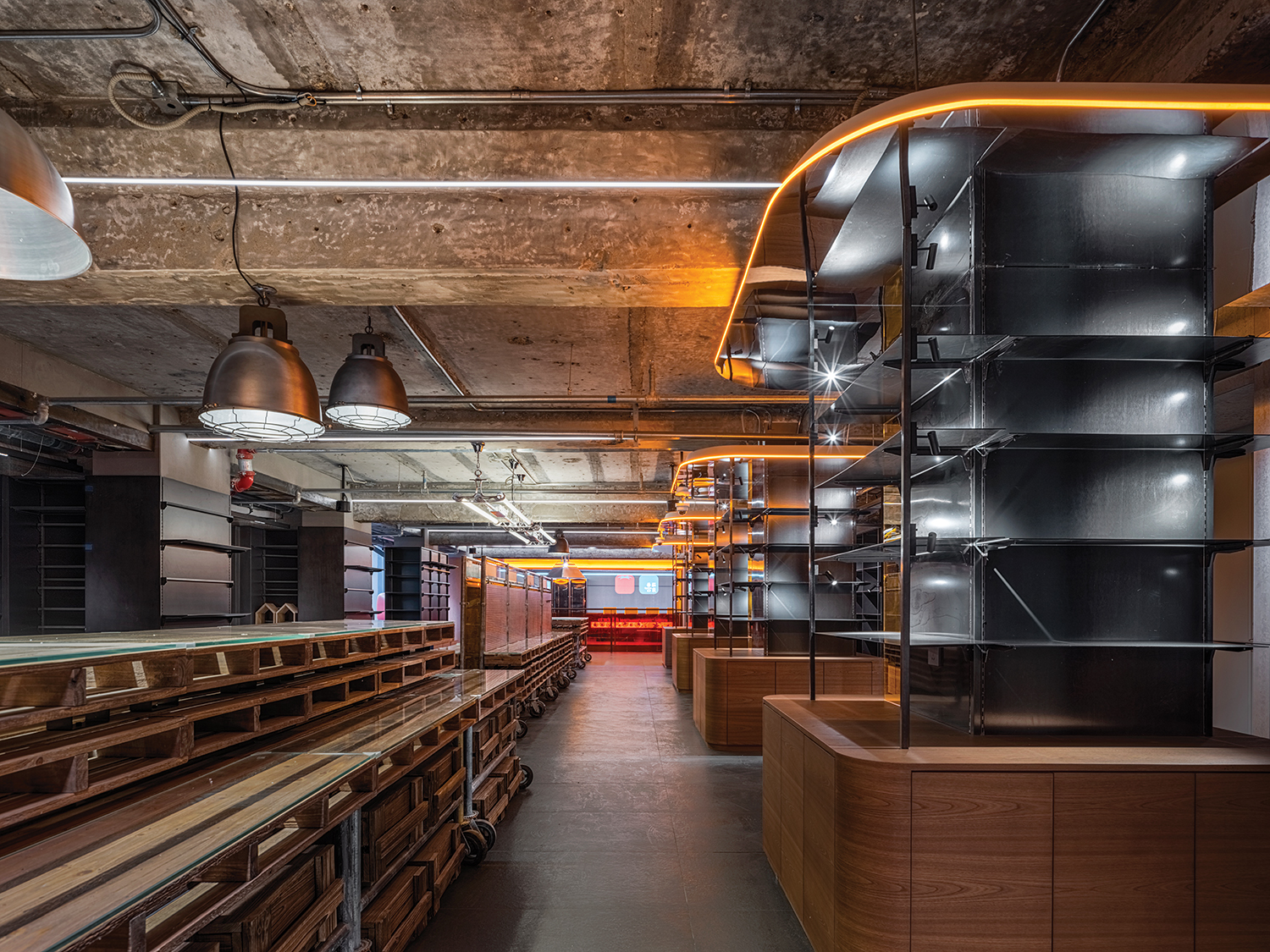
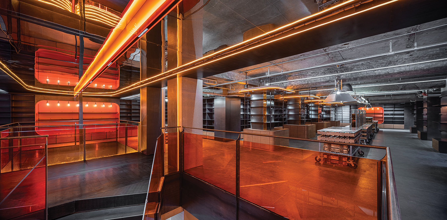
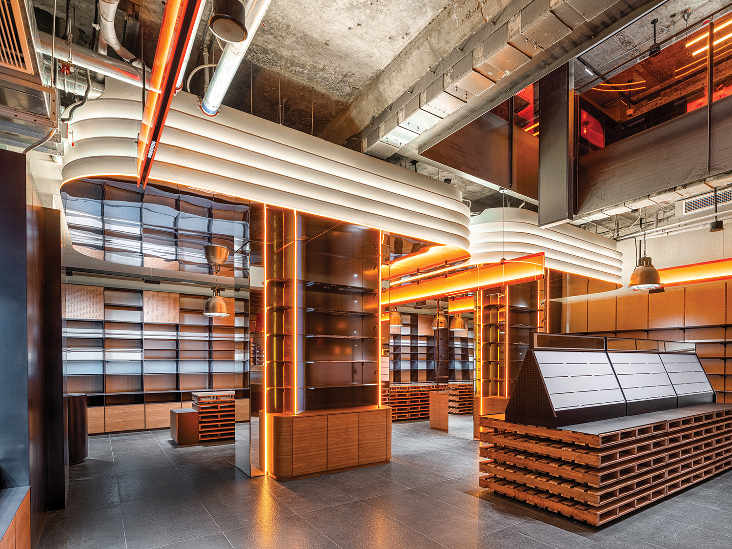
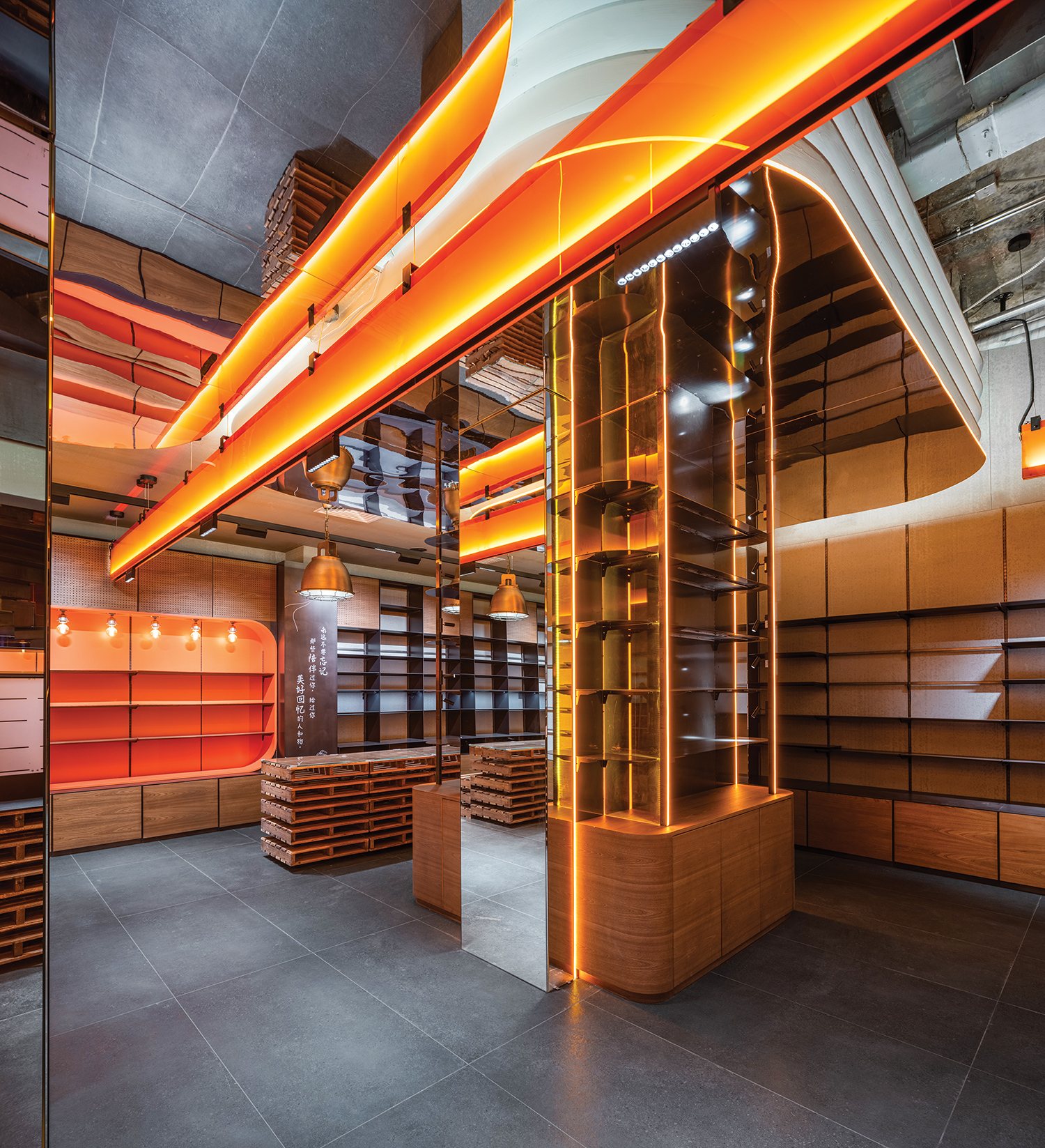
C UN tried to use a style to attract and target shoppers, and this style would be better to be classic and anti-popular. In the end, we chose the 'industrial style' for two reasons, one is the continuation of free style, and the other is the basic building conditions of this Sanlitun store. Next, we took the style as a foundation for makeup, and added multi-factors on the basis of confirming the whole style. Through our research on customer groups, young consumer groups have become more diversified in their preferences. At the same time, they can also view the space modules composed of composite factors from all aspects. Therefore, we organically combined the art toy, IP color, Qpokee series, industrialization, metallic sense, and structure into the unique 'warm industry' style of Qpokee.
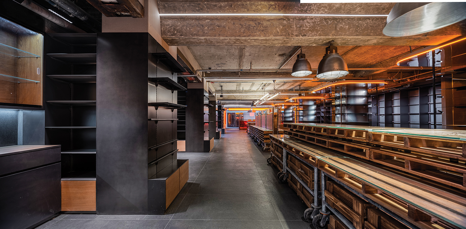
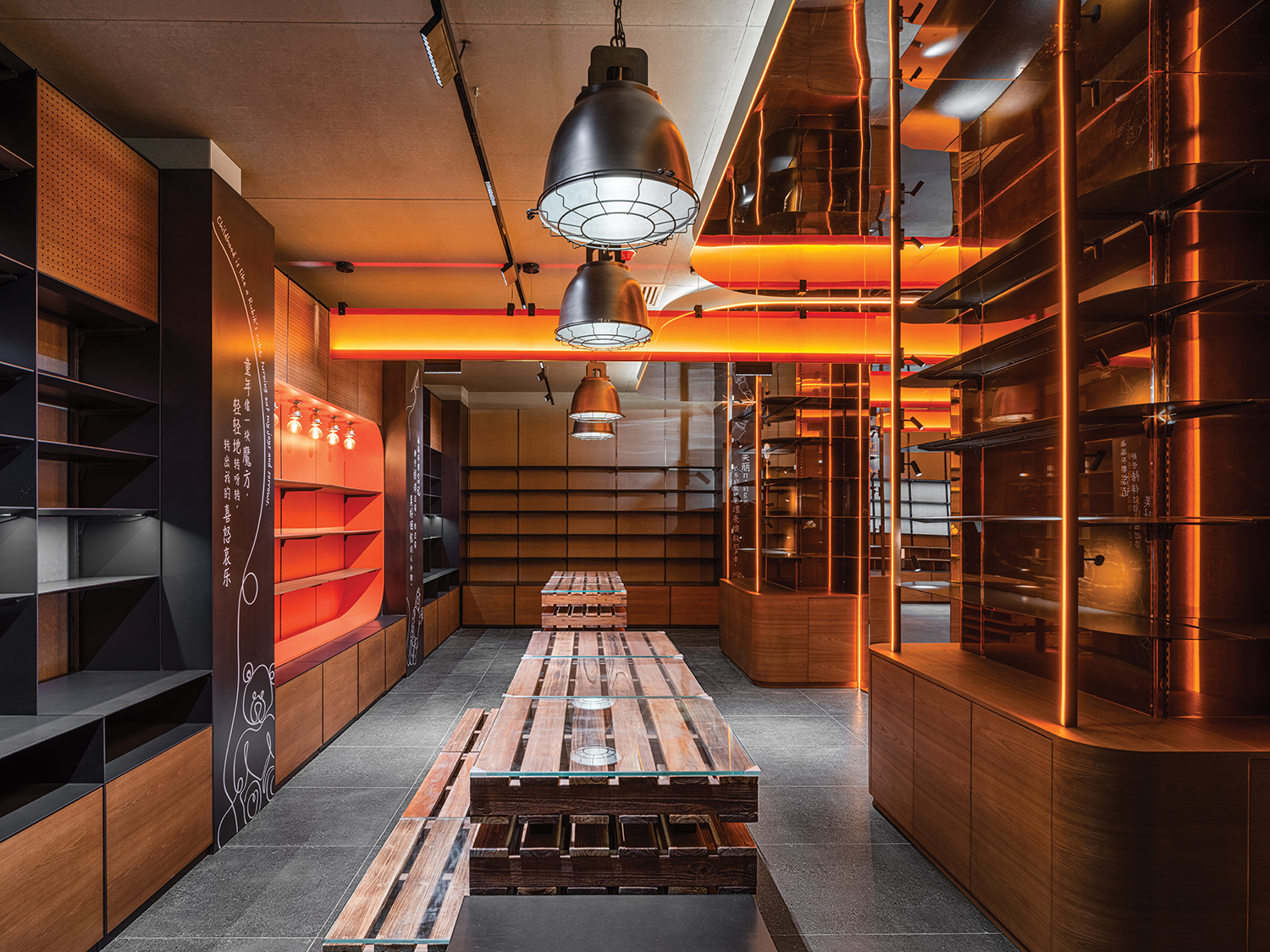
T his is the most important part, because we can accurately find through data that a large percentage of store successes depend on the selection and display of products. It is also a very big test to find improvement on an excellent result. We adopted three methods to complete this goal. Firstly, we spent a lot of time with the whole Qpokee team, especially the store manager and sales to discuss the layout, finally we completed the three-dimensional layout design through product partition layout, dynamic product layout, vertical display layout, and color display layout. Secondly, our team paid attention to the online clients' feedback to the existing stores to enhance and adjust product visualization. Thirdly, CUN team stayed on site to observe the stores operation.
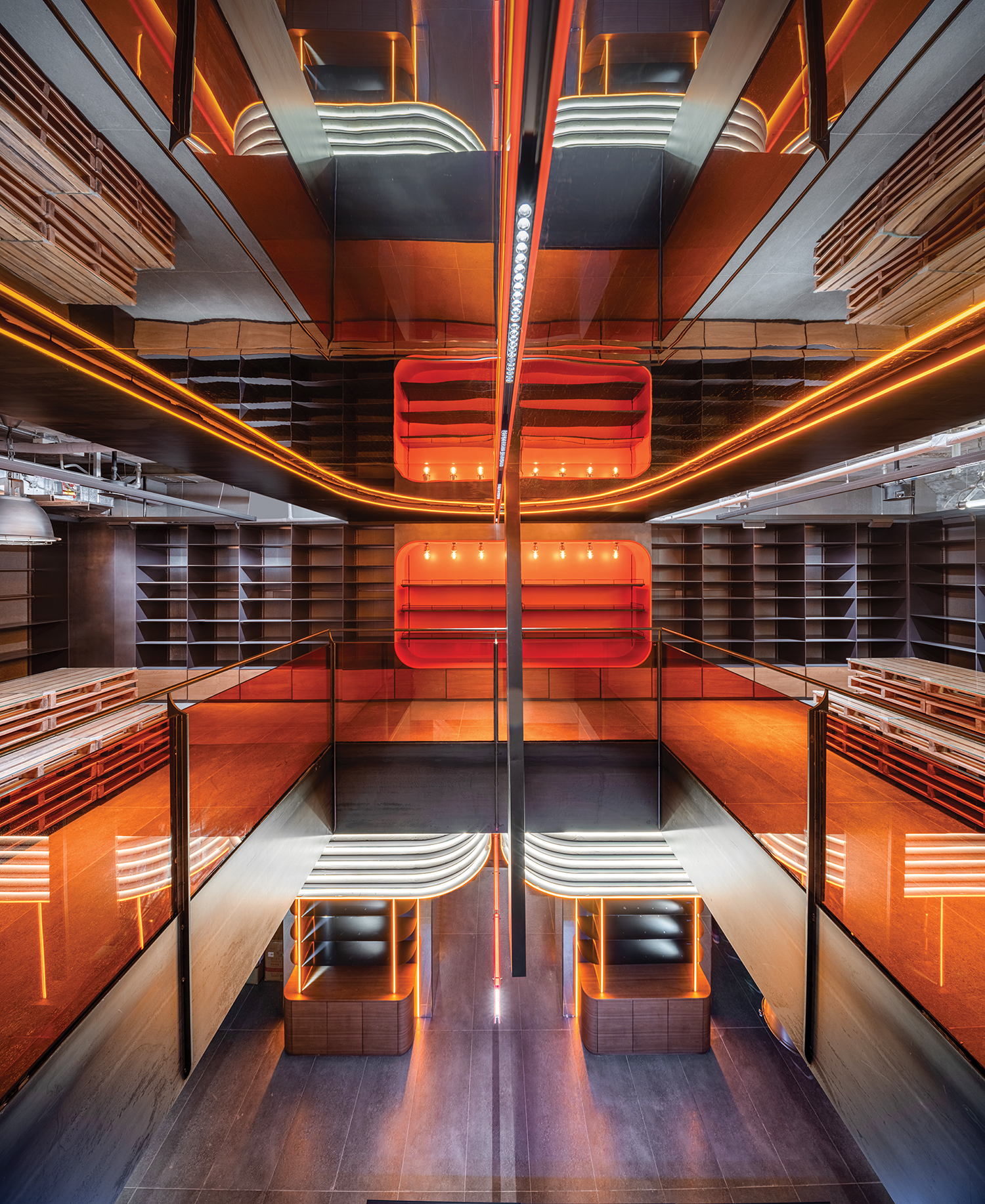
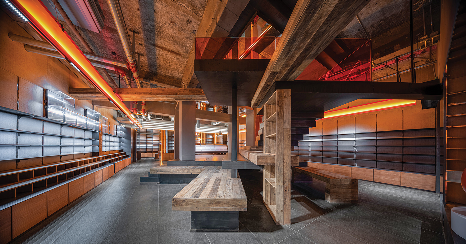
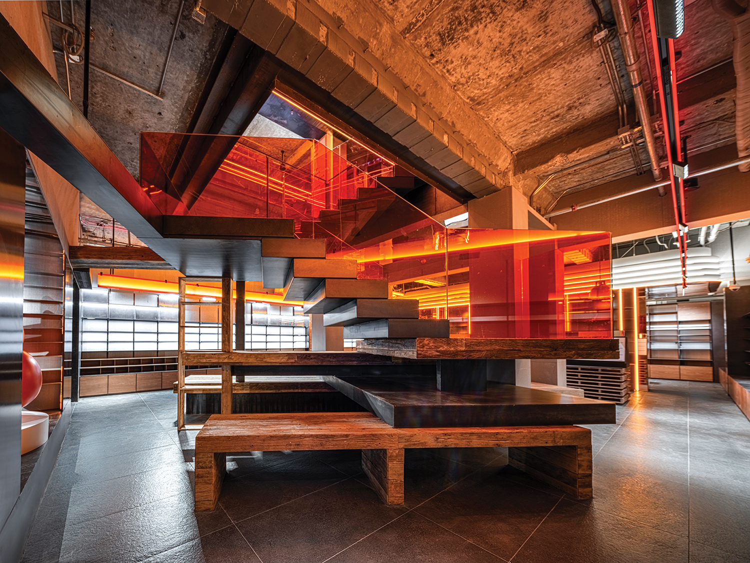
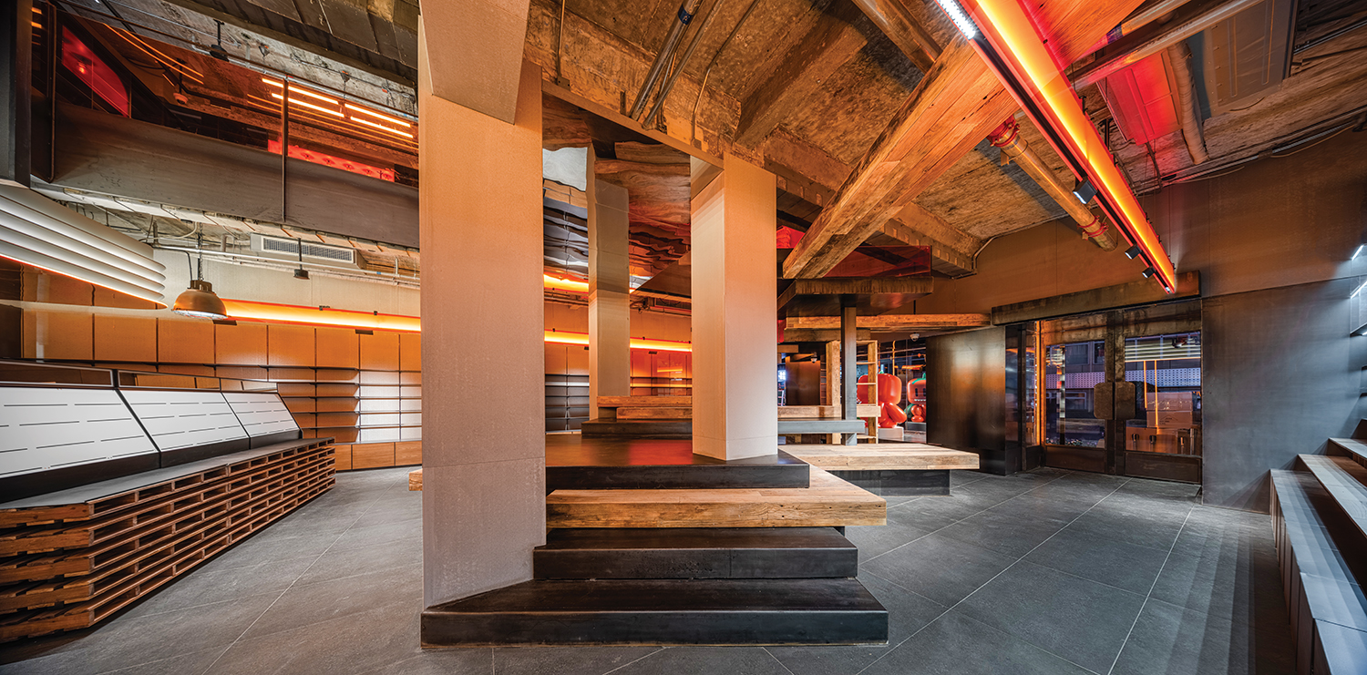
In the end, a more scientific and effective movement line is extended based on 1,200mm in width for 2 people, which can better save spaces. The products are arranged in a logical and scientific layout according to the sales movement lines, their proportions and selling prices. The black steel plate integrates the colors of various products, and then the lighting system highlights and presents products on different levels. After all these done, we improved the efficiency for the products again.
0개의 댓글
댓글 정렬